I really enjoyed the Identity project! It is always interesting for me to photograph my friends, as the end results on the contact sheet always seem to reveal something than more than meets the eye. I'm glad I decided to do two rolls of film instead of one, as my first roll of dramatic lighting didn't turn out nearly as well as I had hoped. To me, I feel like identity can only be defined by the individual, which is why I didn't want to title this identity project. Simply, I am capturing the identity (superficial identity, that is) of my friends. The rest, the underlying layers, are up to them to define. Maybe my pictures can convey their identity, and maybe they can't.


5x7

5x7

5x7

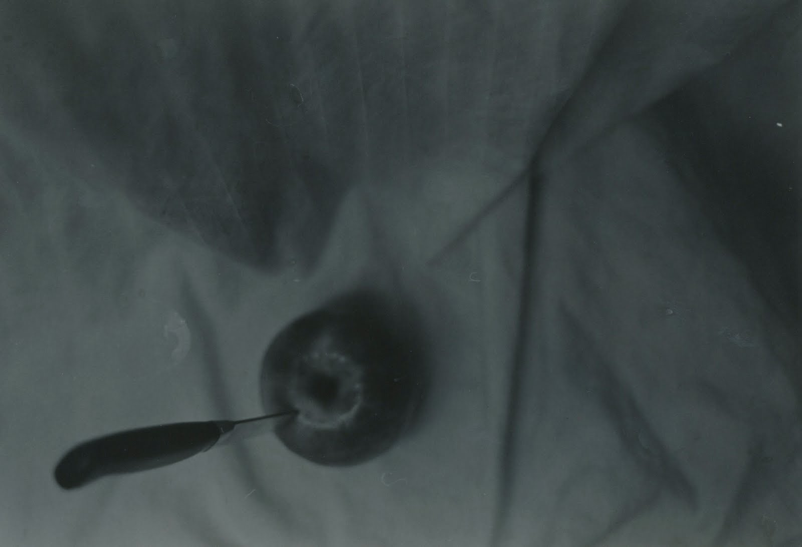
5x7... with a little contamination from not being fixed long enough.

5x7

A 5x7 of my 8x10

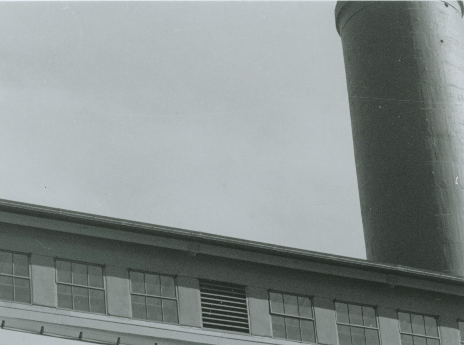
8x10